Summary
I worked on improving the user experience of Skatteverket’s contact page by analyzing user behavior data and conducting user tests. The goal was to make it easier for users to navigate and find the information they need. Additionally, the contact page was redesigned to align with Skatteverket’s upcoming 'blue web' redesign and its new UI design system
I worked on improving the user experience of Skatteverket’s contact page by analyzing user behavior data and conducting user tests. The goal was to make it easier for users to navigate and find the information they need. Additionally, the contact page was redesigned to align with Skatteverket’s upcoming 'blue web' redesign and its new UI design system
Results
We created two versions of the redesigned contact page and conducted A/B testing. In the initial tests, all 20 users found it easier to locate Skatteverket’s contact page and preferred both versions over the current design. After refining both designs, we ran a final round of A/B tests. The results showed that 80% of users favored Version A, although many appreciated the universal information navbar in Version B.
We created two versions of the redesigned contact page and conducted A/B testing. In the initial tests, all 20 users found it easier to locate Skatteverket’s contact page and preferred both versions over the current design. After refining both designs, we ran a final round of A/B tests. The results showed that 80% of users favored Version A, although many appreciated the universal information navbar in Version B.
Insights
Through user testing, I discovered that users struggled to easily find the 'Contact Us' page on Skatteverket's website. This insight led to the initiation of the project, focusing on improving navigation and restructuring the information architecture to make the contact page more accessible.
Through user testing, I discovered that users struggled to easily find the 'Contact Us' page on Skatteverket's website. This insight led to the initiation of the project, focusing on improving navigation and restructuring the information architecture to make the contact page more accessible.
Tools used
Figma | User Testings | Heuristic Evaluation | Matomo Anatlytics | Affinity Mapping | Survey Generator | Figjam | A/B-testing |
Figma | User Testings | Heuristic Evaluation | Matomo Anatlytics | Affinity Mapping | Survey Generator | Figjam | A/B-testing |
My work
Research | User tests | Benchmarking | Interviews with internal stakeholders | Sketching | Prototyping | Recruiting users by Survey Generator | Evaluate the tests | Final presentation.
Research | User tests | Benchmarking | Interviews with internal stakeholders | Sketching | Prototyping | Recruiting users by Survey Generator | Evaluate the tests | Final presentation.

Background
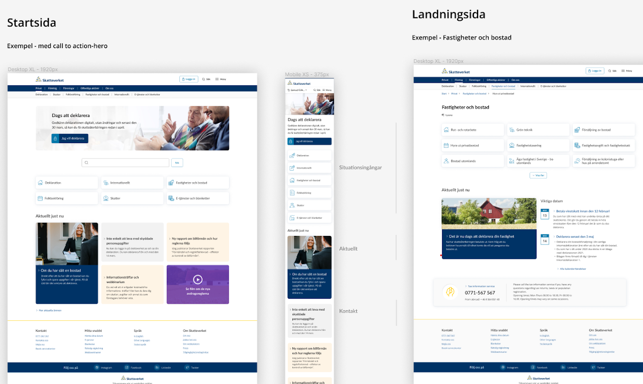
Skatteverket, as an independent authority, serves a wide range of users, each requiring different navigation paths to access the same information on their website. My team and I were tasked with improving user navigation to the authority’s contact page. We were specifically focused on creating a more intuitive contact start page, in alignment with Skatteverket’s upcoming 'blue web' redesign and its new design system.
Problem statement
There was no existing research or documented feedback on how users navigate to the current contact page, nor any insights into their experience with the homepage of the contact section. This lack of data highlighted the need for thorough user research to understand the challenges and improve the navigation experience.
Solution
I redesigned Skatteverket’s universal navigation navbar, making it easier for users to directly access the contact page. Additionally, I created two new versions of the contact page, both aligned with the authority’s new UI design system for the upcoming 'blue web', ensuring a modern and intuitive experience for all users.
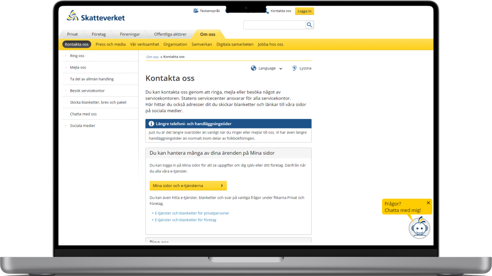
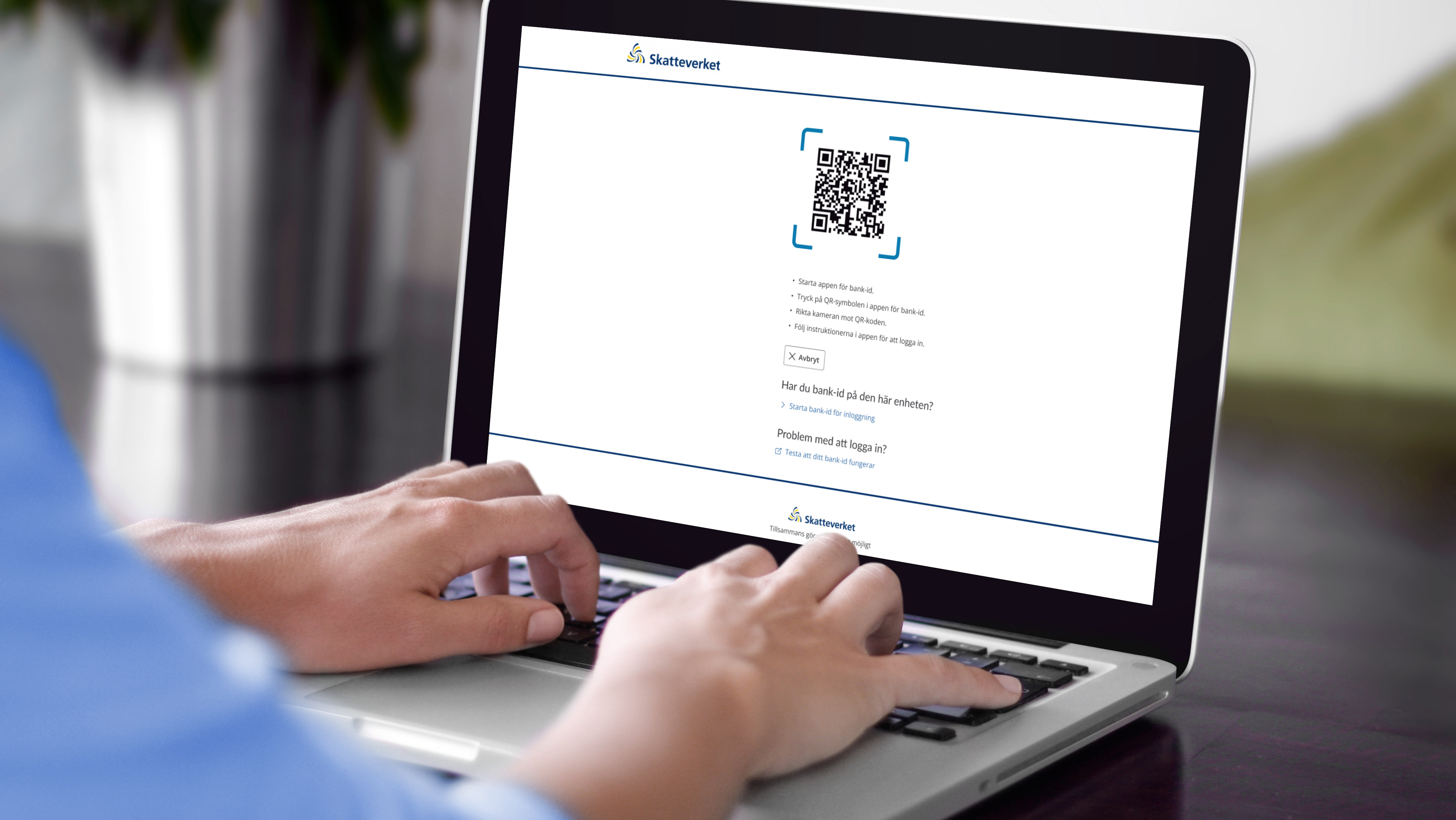
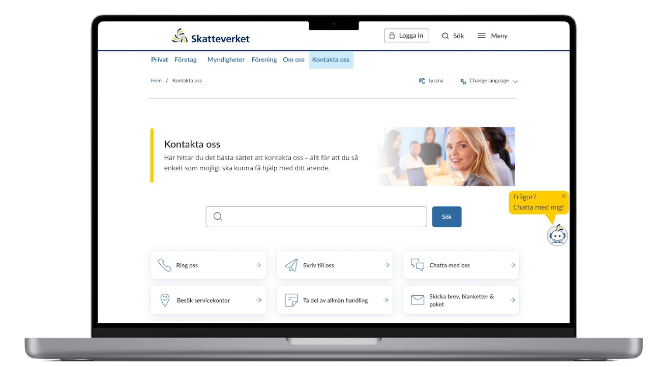
Current contact home page

RESEARCH IMPROVING NAVIGATION
Benchmarking
Analyzed contact pages from authorities, banks, and private entities to identify best practices in navigation and information architecture.
Analyzed contact pages from authorities, banks, and private entities to identify best practices in navigation and information architecture.
Mapping the current contact page
Mapped out the existing design and identified pain points.
Mapped out the existing design and identified pain points.
Hypothesis
Developed hypotheses based on research findings for further design iterations.
Developed hypotheses based on research findings for further design iterations.
User tests & insights
Conducted 6 mobile user tests, documenting responses, first impressions, feelings, and reasons for contacting Skatteverket.
Conducted 6 mobile user tests, documenting responses, first impressions, feelings, and reasons for contacting Skatteverket.
Internal stakeholder interviews
Gathered feedback from internal stakeholders to understand their goals and expectations.
Gathered feedback from internal stakeholders to understand their goals and expectations.
Heuristic evaluation
Evaluated the existing design based on usability principles.
Evaluated the existing design based on usability principles.
Analytics & Heatmaps
Analyzed Matomo Analytics and heatmaps to track user behavior and identify engagement patterns.
Analyzed Matomo Analytics and heatmaps to track user behavior and identify engagement patterns.
Key Insight
60% of users couldn’t find the 'Contact Us' link because it was hidden under the 'About Us' section in the menu.
60% of users couldn’t find the 'Contact Us' link because it was hidden under the 'About Us' section in the menu.

Heatmaps showed that 70% of 1,056 desktop users clicked directly on 'Contact Us' instead of 'About Us,' indicating a preference for direct navigation.
We hypothesized that users wanted easy access to the contact page. To confirm, we recruited 62 participants through Skatteverket’s Survey Generator and finalized 20 for the user tests.

DEFINE CORE CHALLENGES AND USER NEEDS
After conducting thorough research, user tests, and analyzing heatmap data from the current contact page, we identified key issues and needs. With these insights, we formulated our "How might we...?" questions.
We focused on three main factors:
Direct access to the contact page.
Accessibility for all users.
Maintaining a sense of authority and credibility.
Accessibility for all users.
Maintaining a sense of authority and credibility.

IDEATE GENERATE IDEAS
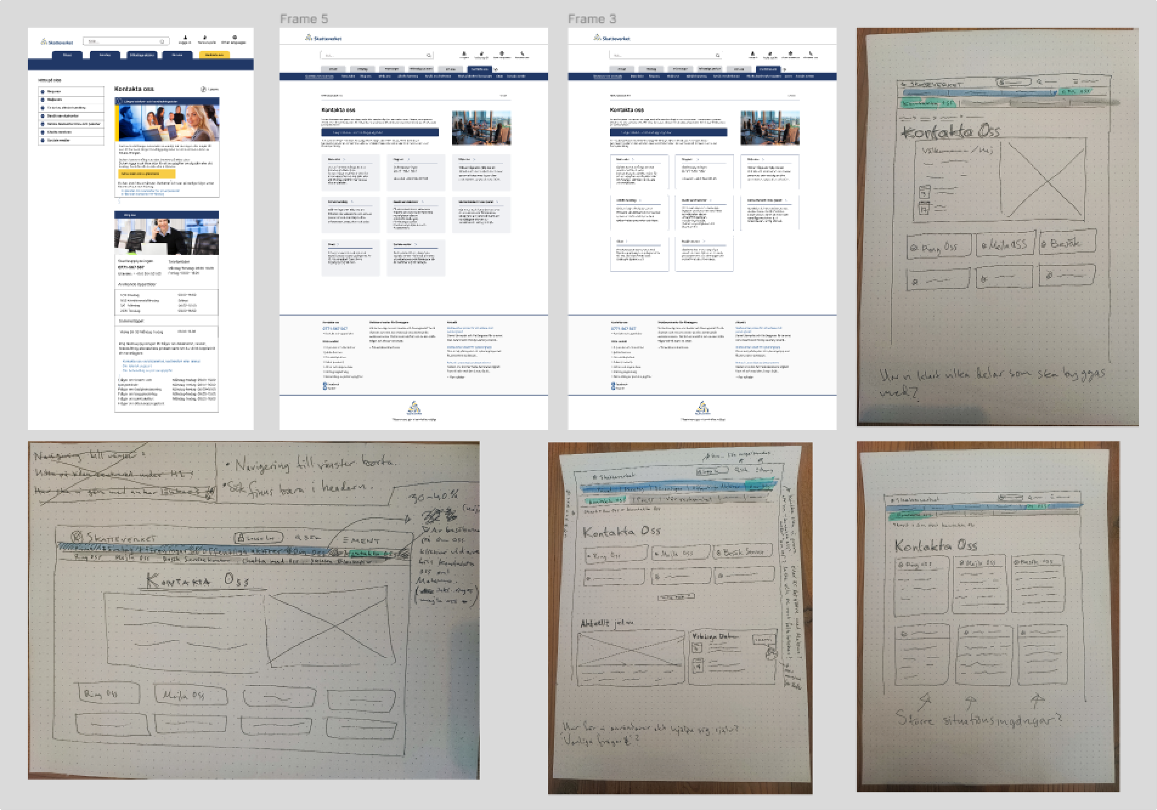
I created sketches and a low-fidelity prototype in Figma to explore design ideas aligned with Skatteverket's new UI design system. Based on our research and insights from the define phase, we focused on key elements to improve the user experience while ensuring consistency with their updated visual identity.

PROTOTYPE
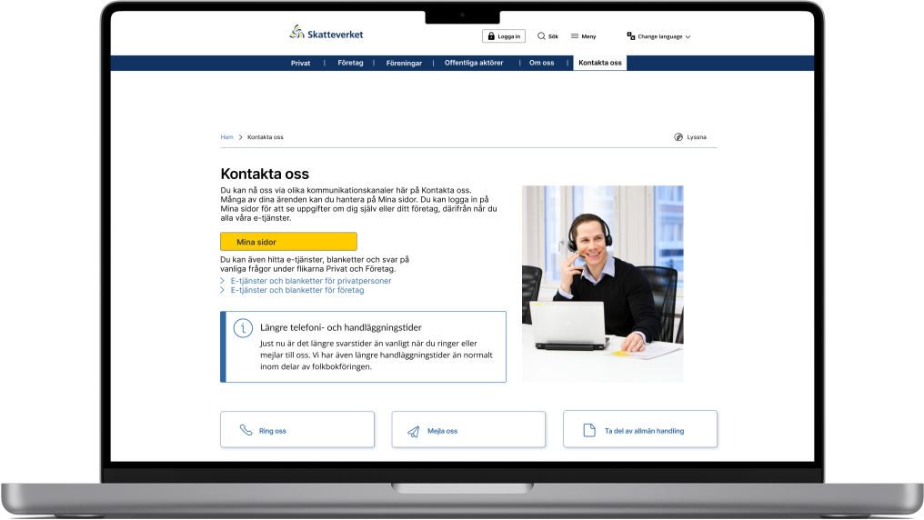
Version A
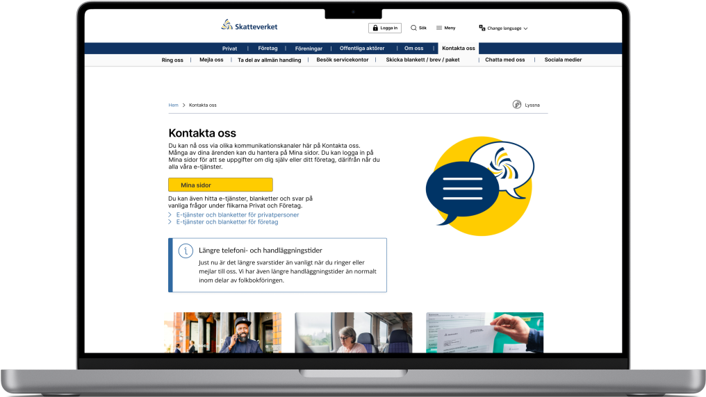
Version B
Created two versions of the contact homepage for A/B testing to determine user preferences.
Contact Us' from 'About Us' to the universal information navbar for better visibility and easier navigation.
Contact Us' from 'About Us' to the universal information navbar for better visibility and easier navigation.

TEST AND EVALUATE

Findings & Next Steps
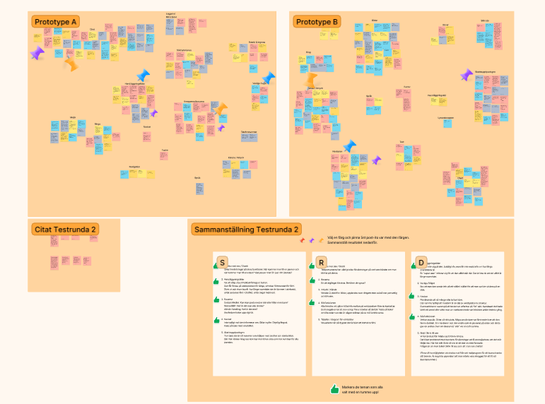
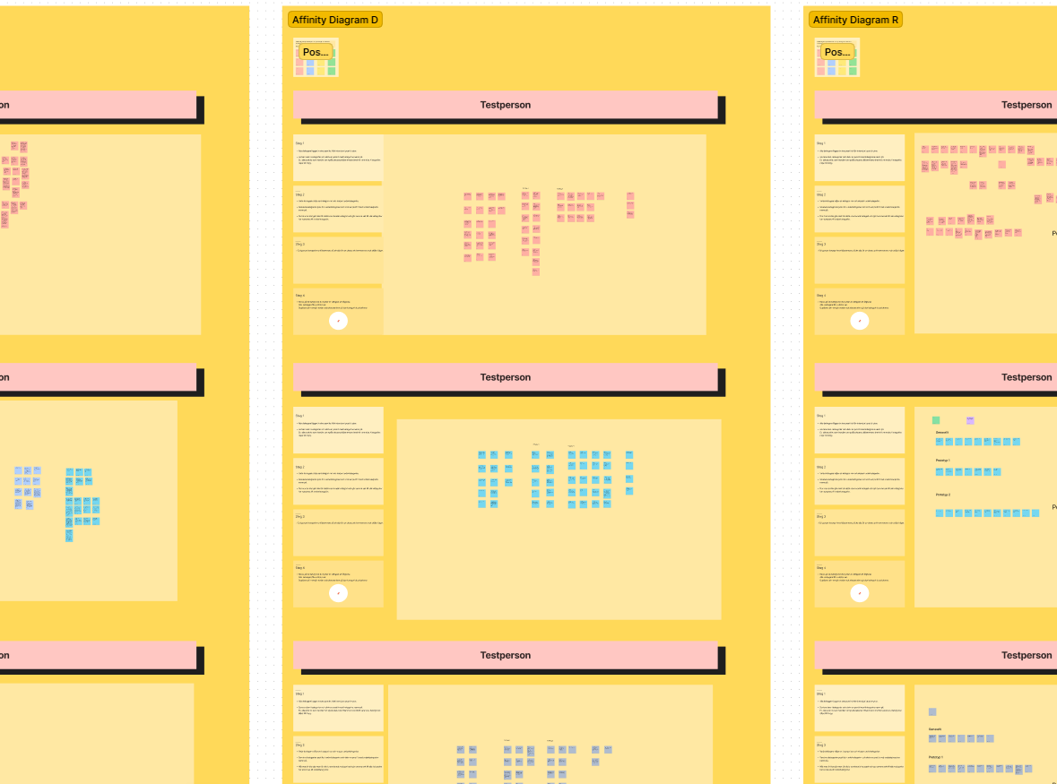
Conducted affinity mapping to gather and cluster insights.
Conducted affinity mapping to gather and cluster insights.
10 users from the first A/B test found it easier to locate the contact page and preferred both new versions over the current one.
Compiled findings to inform the next design iteration.

FINAL PROTOTYPE

Version A

Version B
The final design iteration yielded two A and B versions of Skatteverket's "Contact Us" homepage.

FINAL TEST AND EVALUATION

Final Insights & Results
Conducted final 10 interviews and A/B tests with the new design versions of the contact homepage.
Affinity mapping and insights revealed that 20 out of 20 users found it easier to locate Skatteverket’s contact page and preferred both new versions over the current one.
After the final design iteration
80% of users preferred version A for its cleaner, more accessible look that still maintained an authoritative feel.
Users favored the universal information navbar from version B.
The insights and results will inform the development of an improved contact homepage for Skatteverket by its UX team.
Looking forward for future collaborations or just want to say hello? Let us connect!
susannejonsson.ux@gmail.com